
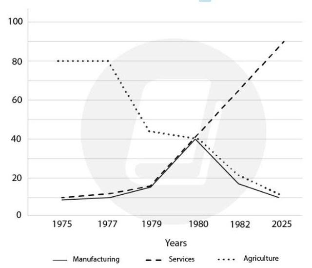
The line graph demonstrates the tendency and predictions of employment in three fields: Manufacturing, Services and Agriculture from 1975 to 2025 in the USA.
From an
overall
perspective, Linking Words
it is clear that
there were opposing trends for 3 sectors , the rate of Service job positions was in an upward trend, Linking Words
while
Agriculture strongly declined and Manufacturing fluctuated over the period of approximately 50 years.
A deep analysis of the bar chart provided reveals from 1975 and 1980, both the Manufacturing and Services proportions of employment were more or less the same, starting from around 10% in 1975, Linking Words
then
gradually increasing to 15% in 1979 and had an enormous climb to 40% in 1980. After 1980, the two aspects had an adverse movement, Linking Words
whereas
the Services ratio increased dramatically from 40% to 90% between 1980 and 2025, and the Manufacturing percentage fell sharply from 40% to 10% respectively.
It can be concluded from the graph that the number of people who were employed in Agriculture remained stable rate at 80% from 1975 to 1977, Linking Words
then
dramatically went down to 42% in 1979. After 1980, there was another significant decline from 40% to 10% in 2025.Linking Words