
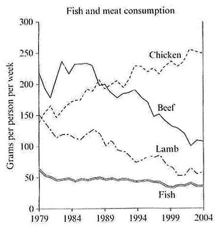
The line graph illustrates data about citizens of a certain European country who nourished 4 different types of meat between 1979 and 2004 over 2 and half decades
such
as beef, chicken, lamb and fish.
Linking Words
Overall
, we can notice that Beef was the most popular at the beginning, though by the end of the Linking Words
,
period chicken became the most demandable.
Remove the comma
apply
Firstly
, Linking Words
the
beef started at 220 but it plummeted to 180 and Correct article usage
apply
then
it rocketed to 240 and faced a slight dip to 230 in 1984 Linking Words
while
chicken started at 145 and rose considerably to 160 Linking Words
following
Linking Words
this
it decreased gradually to 147. Linking Words
Next,
the number saw a steady improvement until 1989 Linking Words
then
the number fluctuated.
Linking Words
Secondly
, lamb started at 150 and witnessed a dramatic fall to 120 after which it was unstable and carried on going down. Linking Words
On the other hand
, first started at 55 and kept decreasing negligibly over the period and it was the least demandable item throughout the period in question. By 1999 it hit a trough and by 2004 it recovered.Linking Words