
On the
graph
Use synonyms
showed
, we can analyze a comparison that was made between distinct Wrong verb form
shown
energy
Use synonyms
production
methods.
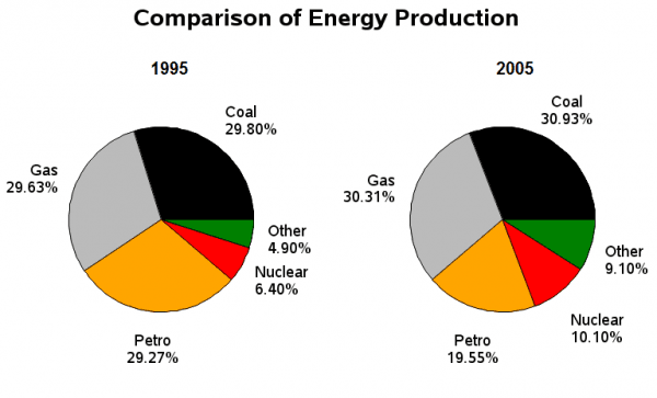
First of all, we can clearly see that two graphs are shown, the first one is from 1995, and the second one is from 2005. In the first Use synonyms
graph
, we can see that the Use synonyms
energy
with the largest Use synonyms
production
was coal, with Use synonyms
a
29.80% of all the Correct article usage
apply
energies
compared, followed by gas representing 29.63%, making Use synonyms
this
method of Linking Words
production
the second most significant value on the Use synonyms
graph
. After these, follows petro with 29.27%, Use synonyms
then
nuclear Linking Words
energy
with Use synonyms
a
6.40%, and Correct article usage
apply
last
but now not least go other Linking Words
types
of Use synonyms
energies
. After taking a look at the results from 1995, we can compare and contrast them with the results from 2005, where we can see some really interesting features.
Use synonyms
To begin
, it can be noted that the rankings of Linking Words
energy
that Use synonyms
producted
the most amount in their respective years, Correct your spelling
produced
produce
is
exactly the same in both graphs, the order being; coal, gas, petrol, nuclear, and Correct subject-verb agreement
are
lastly
the other Linking Words
types
of Use synonyms
energy
which are not specificated on the Use synonyms
graph
. Use synonyms
Nevertheless
, among that huge similarity, we can see that nuclear Linking Words
energy
Use synonyms
production
rose by Use synonyms
aproximately
four Correct your spelling
approximately
percent
. Not only Change the spelling
per cent
this
, Linking Words
however
the other Linking Words
types
of Use synonyms
Use synonyms
energies
Fix the agreement mistake
energy
also
were affected having an increase in their Linking Words
productions
.
The three Fix the agreement mistake
production
types
of Use synonyms
energy
that had a bigger Use synonyms
production
over the years, stayed being the most influential ones, Use synonyms
nonetheless
, we can see that their percentage suffered a fall, Linking Words
due to
the increase of the other Linking Words
energies
.
In conclusion, we can see that the Use synonyms
production
of Use synonyms
energy
did not Use synonyms
suffered
from any changes over the years.Change the verb form
suffer