
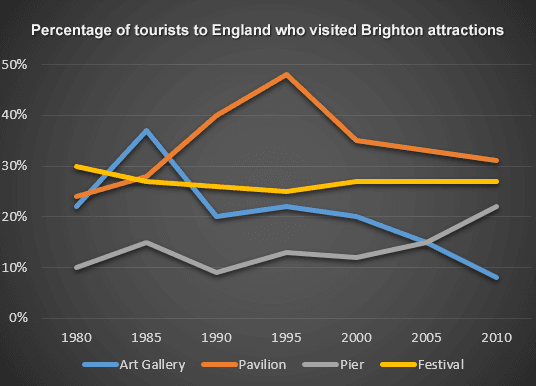
The line graph given provides a comparison of the proportion of visitors to England who went to various tourist attractions in Brighton between 1980 and 2010.
From an
overall
perspective, it is evident that Linking Words
while
the percentages of those who visited the Pavilion and the Pier showed a downward trend, a reserve pattern could be observed in the figure for the Art Gallery and the Festival over the surveyed period.
In 1980, the percentage of visitors who participated in the Festival was the highest, at exactly 30%. The data on the Pavilion and the Art Gallery were lower, at around 24% and 22%, respectively. The Pier, Linking Words
however
, accounted for the lowest, at only precisely 10%.
After reaching a peak of approximately 48% in 1995, the percentage of travellers going to the Pavilion declined dramatically to just over 30% in 2010. The data on Art Gallery witnessed a similar trend in which it soared to somewhere in the vicinity of 36% in 1985 before dropping sharply to a low of just around 9% over the years. The period between 1980 and 2010 saw a fluctuating increase in the proportion of tourists who when to the Pier to over 22% which was lower than the final figure for the Festival, at approximately 28%.Linking Words