
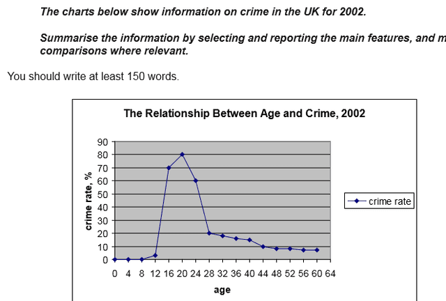
The graphic shows a breakdown of
crime
statistics in the UK for Use synonyms
last
year. The line graph shows the interrelation between criminal activity and Linking Words
age
Use synonyms
while
the pie chart illustrates the proportion of four different Linking Words
crime
types.
When looking at the line graph it is immediately clear that young Use synonyms
people
accounted for a disproportionately high level of Use synonyms
crime
Use synonyms
last
year and that the Linking Words
age
at which Use synonyms
people
are involved in criminal activity peaks at twenty with nearly a million Use synonyms
crimes
being committed by Use synonyms
people
of Use synonyms
this
Linking Words
age
. The number of Use synonyms
crimes
Use synonyms
then
plummeted before levelling off at 28. the likelihood of being involved in criminal activity continued to decline with Linking Words
age
.
Of the Use synonyms
crimes
identified in the bar chart, violent Use synonyms
crime
was the most common at nearly half of the total, and there were twice as many Use synonyms
crimes
involving violence as there were property or drug Use synonyms
Use synonyms
crime
. Less serious Fix the agreement mistake
crimes
anti social
Add a hyphen
anti-social
behaviour related
Add a hyphen
behaviour-related
crime
was relatively low.
Use synonyms
Overall
, Linking Words
it is clear that
young Linking Words
people
were much more likely to be the perpetrators of Use synonyms
crime
and that the majority of Use synonyms
this
Linking Words
crime
was violence related.Use synonyms