
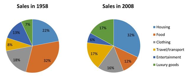
The pie chart gives data on people’s expenditure on separate products and recourses in a specific country in Europe in 1958 and 2008. From an
overall
perspective, it is readily apparent that there were some major changes in some parts over the years, Linking Words
while
others stayed roughly the same.
To start, it appears to be visible that in 1958 the three most dominant commodities that were sold the most were clothing, food, and housing which take up almost more than three-fourths of the circle. The remaining have relatively the same numbers with an average of around 10.
Linking Words
Furthermore
, in the year 2008, the three most prominent things in the sphere decreased to 60 with the other services Linking Words
such
as luxury goods and travel both expanding to be less than a fifth, Linking Words
however
, spending on entertainment had gone down to become the least in sales with five less than its original number.Linking Words