
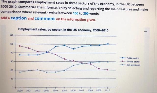
The line chart illustrates the number of workforce hired within three industries in the United Kingdom, from 2000 to 2010. The field comprises public, private and self-employment. During the period range, most of the employees were hired by state-owned related enterprises,
whereas
the amount of private industry workers plummeted to the lowest among all in 2010.
From the year 2000 to 2003, the estimate of private-held businesses' employment strived above 40% Linking Words
while
other fields only touched below 40%. Linking Words
However
, the percentage was later overturned by the public division when entering 2004 to 2007, private-owned companies gradually decreased by 10% in the three-year span. Linking Words
On the other hand
, the public-owned enterprises' employment rate surged to almost 50% Linking Words
although
plateaued in a couple of years yet was still stable at a 50% rate. Not only sudden change occurred for self-employed individuals, but Linking Words
also
climbed and even surpassed the private sector's rate to 30%.
The rank sustain for both three job sectors until 2010, notably, with the public-owned business as the top employee acquisitor at slightly above 50%, followed by self-employment at 30% and privately owned businesses at 20%.Linking Words