
The three pie charts below show the changes in annual spending by a particular UK school in 1981, 1991 and 2001 . Units are measured in percentages.
Overall
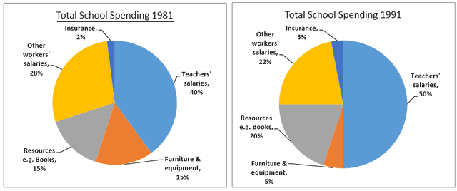
, it can be seen that the biggest part of the resources was invested in teachers' salaries in all of the Linking Words
years
. Spending for things like books and physical improvements varied with time and insurance was the lowest expenditure for all of the Use synonyms
years
.
Paying their educational staff was the biggest spending in all three Use synonyms
years
(40% in 1981, 45% in 2001 and a peak of 50% in 1991). Insurance payments fluctuated between 2% in the first year and slightly raised to 8% in the Use synonyms
last
year, but it still was the smallest part of the budget.
Other workers' salaries percentage decreased through the Linking Words
years
(28%, 22% and 15% respectively). Other things like resources and furniture and equipment varied between 9% and 23%Use synonyms
,
but yet remained in the middle of the chart fraction.Remove the comma
apply