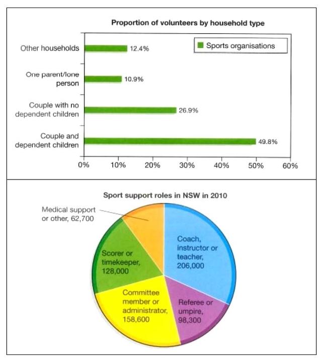
The bar chart shows the number of volunteers in New Zealand who helped in sports organizations in 2010. The pie chart illustrates the number of volunteers doing different types of jobs for that same period. Summarize the information by selecting and reporting the main features, and make comparisons where relevant.

The bar chart shows the number of volunteers in New Zealand who helped in sports organizations in 2010. The pie chart illustrates the number of volunteers doing different types of jobs for that same period. Summarize the information by selecting and reporting the main features, and make comparisons where relevant.
The bar
chart
serves the amounts of people who were involved in charity sports organizations in 2010.
While
the pie
chart
illustrates the proportions of them in several kinds of occupations at the same time.
Overall
, from the bar
chart
it can be seen that most of the volunteers were come from couples and dependent children.
Moreover
, as being served by the pie
chart
, most of the people who took help in the organisation worked as a coach, instructors, or a teacher. Looking into detail, the bar of couples and dependent children dominated the proportion with 49% of the volunteers. It was followed by couples with no dependent children with 26.9%. The other household took 12.4% of them, and the least was one parent/lone person which stands for 10.9% of the proportion.
Furthermore
, the
amount
Change the quantifier
number
show examples
of volunteers was dominated by the coach, instructor or teacher with 206,000 members. In the second place, there was a group of Committee members or administrators with 158,600 persons.
Submitted by ieltscuns2022 on

Unauthorized use and/or duplication of this material without express and written permission from this site’s author and/or owner is strictly prohibited. Excerpts and links may be used, provided that full and clear credit is given to Writing9 with appropriate and specific direction to the original content.

Vocabulary: Replace the words chart with synonyms.
Vocabulary: Only 5 basic words for charts were used.
Vocabulary: The word "chart" was used 4 times.
Vocabulary: The word "amounts" was used 2 times.
Vocabulary: The word "proportions" was used 3 times.
What to do next:
Look at other essays: