
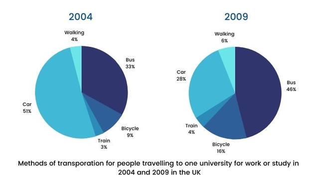
The two charts compare five categories of UK travelling percentage of university (train, bicycle, bus, walking, car,) from 2004 to 2009) Units are measured in proportion.
It is noticeable that the percentage of cars experienced a significant fall over 5 years period.
While
Linking Words
this
figure for buses applies saw a big rise.
In 2004, 51% of the average UK work or study rate went on cars which was the largest pie of the chart, Linking Words
however
, by 2009 the figure for Linking Words
this
category had fallen by 28%. During a decade, the demand for buses at UK universities experienced a considerable increase from 33% to 46 %. In terms of tripping ,the bicycle category made up 9% in 2004 after 20 years Linking Words
this
figure saw a sharp increase to 46% making it the largest retail sector of all.Linking Words