
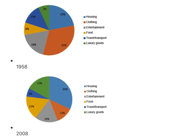
The given pie charts illustrate a comparison of the total expenditure which residents in a European country spend on various goods and services in two distinct years, 1958 and 2008.
From an
overall
perspective, it is evident that Linking Words
while
spending on Housing, Travel/Transport, and Luxury goods showed an upward trend, a reverse pattern could be observed in the figures for the other categories.
In 1958, the percentage of citizens' budget on Food was the highest, at 32%. The figures for the remaining categories, except for Luxury goods which accounted for the lowest proportion of only 7% were lower, ranging from 8% to 22%.
From 1958 to 2008, the proportion of expenditure on Food decreased to only 12%. There was Linking Words
also
a notable fall in the expense of Clothing and Entertainment to 16% and 6%, respectively, in the final year. Linking Words
In contrast
, the data on Travel/Transport and Luxury commodities witnessed a significant rise to the same figure which was 17% in 2008, and the country saw a rapid increase in that of Housing to 32%Linking Words