
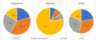
The given pie charts illustrate the percentage breakdown of goods exported from three South American
countries
, in 2010.
Use synonyms
It is clear that
Linking Words
while
Argentina and Chile’s Linking Words
exports
were distributed more evenly amongst other nations, the large majority of Mexico’s Use synonyms
exports
were to the Use synonyms
USA
.
From the charts, it can be seen that Argentina and Chile’s export trends were almost identical, with the majority of their Use synonyms
exports
going to other Latin American Use synonyms
countries
, at 38% for Argentina, and 31% for Chile. Meanwhile, 26% of Argentina’s Use synonyms
exports
went to Europe, 16% to the Use synonyms
USA
, and 20% to other Use synonyms
countries
. Use synonyms
Similarly
, Chile’s Linking Words
exports
consisted of 30% to Europe, 18% to the Use synonyms
USA
, and 21% to other Use synonyms
countries
.
Use synonyms
In contrast
, the large majority of Mexico’s Linking Words
exports
were to the Use synonyms
USA
, at 82%. The remaining Use synonyms
exports
from Mexico were to Europe, at 6%, other Latin American Use synonyms
countries
, at 6%, and other Use synonyms
countries
, Use synonyms
also
receiving 6%.Linking Words