
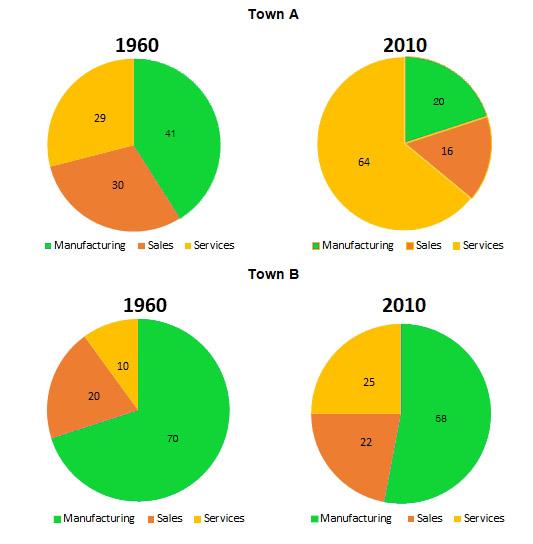
The given pie charts represent the variations for 3 employment sectors in two Towns A and B over 4 decades.
Initially
, for Town A, in 1960 the sector in most demand has been manufacturing which has dropped to almost 50 per cent over 4 decades and a similar trend in sales can be observed. Linking Words
On the other hand
, the field of services has doubled becoming the most popular sector in 2010.
In Town B, the manufacturing industry dropped in the Linking Words
40 year
period by a few per cent. Add a hyphen
40-year
However
, the field of services has boomed over time rising by more than 50 per cent. A small rise can be seen in Linking Words
sales
sector.
In conclusion, both Add an article
the sales
the
Towns A and B have seen a drastic rise in the service industry and a dip in the manufacturing field with some fluctuations in the sales industry in less than half a century.Correct article usage
apply