
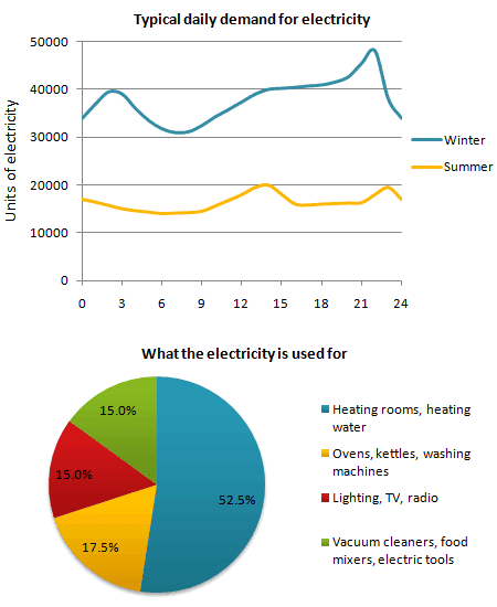
The line graph depicts the
units
of power utilized during the months of winter Use synonyms
as well as
summer, throughout the day. Linking Words
Additionally
, the pie chart illustrates the amount of electricity used for each electronic device in any household in England.
Linking Words
Overall
, the most were utilized during the colder season, exceeding 40,000 and nearing 50,000 Linking Words
units
at midnight. Use synonyms
However
, in comparison , the highest number recorded in summer were at noon, till around 3p.m and late at night, exactly 20,000 Linking Words
units
. Interestingly, the per cent of the electricity for heating water and the rooms was 52% which was the most usage of power noted.
Use synonyms
Similarly
, a trend observed in the cold and the hot weather was that the lowest was consumed between 6 to 9 a.m, marginally above 30,000 and around 15,000 Linking Words
units
respectively. The quantity of power consumed for ovens, kettles, washing machines and for lighting, TV, and the radio was 15% each. Vacuum cleaners, food mixers and other electric tools used 18% of electricity.Use synonyms