
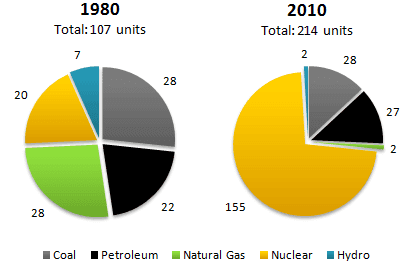
The pie charts illustrate the amount of each type of energy : coal, petroleum, natural gas ,nuclear and Hydro, produced in both 1980 and 2010 .
Overall
, Linking Words
while
in 1980 most parts of the energy was represented by natural gases and coal, in 2010 nuclear energy has become the most popular type of power.
Linking Words
Firstly
, meanwhile in 1980 Nuclear power represented only 20 parts of the world's vitality, in 2010 it increased to 155 units, becoming the main force source. Linking Words
Secondly
,petroleum had a small growth over the given period , from 22 to 27 units.
Linking Words
Furthermore
, the biggest decline has occurred in natural gas production, starting from 28 parts of the world's electricity, and ending at 2 proportions. Linking Words
Nevertheless
,the only form of power source that remained constant was coal, so it represented 28 units in both years.Between 1980 and 2010, Hydropower stayed the least-used type of capacity , changing from 7 sections to only 2 sections.Linking Words