
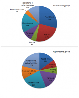
The pie charts illustrate what percentage of their income two different groups spent on activities and things.
Overall
, Linking Words
while
the low-income Linking Words
group
spent most of their money on food and drinks, the high-income Use synonyms
group
spent the highest percentage of their income on miscellaneous.
Use synonyms
Firstly
, communities who earn less spend 29% of their income on food and drink, Linking Words
while
rich individuals spend only 15% on Linking Words
this
category. Meanwhile, people who earn more money spend 21% of their salary on recreation and culture Linking Words
while
the other category spends just 11%. Linking Words
Also
, Linking Words
while
the high-income class spend 12% of their earnings on restaurants and hotels, the crowd who earn less spend the least amount of payment on these activities, 4%.
Linking Words
Nevertheless
, both categories spent about the same bill on clothing, 5% and 6%. Linking Words
Furthermore
, they spent similar percentages on miscellaneous, for the high-livelihood Linking Words
group
representing 18% of their earnings and for low low-cash Use synonyms
group
representing 23%.
A big difference is made by fuel bills. Use synonyms
While
for individuals who earn more money bills consume only 7% of their salary, for low-income communities Linking Words
this
category consumes 24% of their salaries.Linking Words