
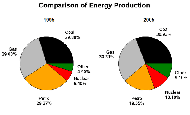
The pie charts delineate information about the proportion of various types of energy production in the United Kingdom from 1995 to 2005.
After analysing the charts it is clearly seen that there was negligible difference in the percentage of energy generation by gas in both ages.
Moreover
, in 1995 the origination of coal was 29.80%, Linking Words
whereas
it increased by 1% in 2005. The percentile of nuclear was 16.50% collectively in the given two years.
Linking Words
Furthermore
, in 1995 and 2005 the contribution of coal was nearly 29.80% and 30.93% respectively.
Interestingly petrol was the only source that decreased in 2005 by 10%. Linking Words
Additionally
, the other sources were approximately 15% in the former and latter eras.
Linking Words
Overall
, it is striking that all the sources were raised in the latter year, whilst only petrol declined in 2005. Linking Words
Besides
, the maximum involvement was of coal and the minimum contribution was from other sources throughout the period.Linking Words