the graphs show basic information about employment

the graphs show basic information about employment
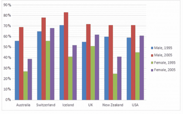
The bar chart illustrates the percentage of employment for males and females from different countries in 10 years
Overall
, male in 2005 was the highest percentage
while
female in 1995 was the lowest in all country
To begin
in Australia the number of employed males in 1995 was 56% and females was 27%, after 10 years, it has increased to 69% and 39%. New Zealand is pretty similar to Australia when it had 60% of male employment and 26% of female employment in 1995
then
in 2005 was 71% and 41%. Switzerland has 65% male and 57% female in
Submitted by trung642k6 on

Unauthorized use and/or duplication of this material without express and written permission from this site’s author and/or owner is strictly prohibited. Excerpts and links may be used, provided that full and clear credit is given to Writing9 with appropriate and specific direction to the original content.

Sentences: Add more complex sentences.
Common mistake: Your writing should be 150-250 words.
Vocabulary: Only 5 basic words for charts were used.
Vocabulary: The word "percentage" was used 2 times.
Topic Vocabulary:
  • employment sectors
  • economic cycles
  • recessions
  • booms
  • demographic groups
  • qualifications
  • employability
  • globalization
  • outsourcing
  • multilingual
  • remote work
  • freelance
  • technological advancements
What to do next:
Look at other essays: