
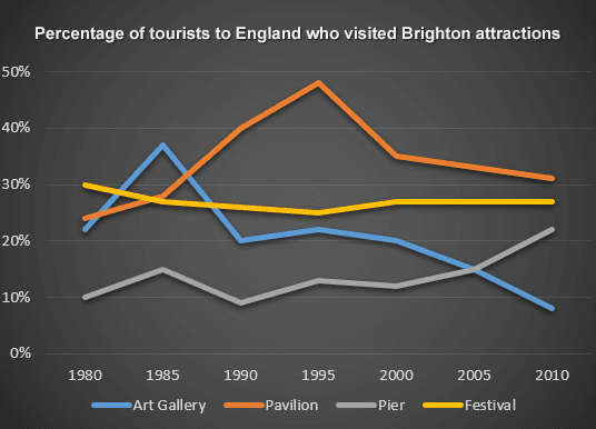
The line graph provides information about the percentages of travellers who went to Brighton Monuments in England between 1980 from 2010.
Overall
, it can be seen that the most visited attraction was the pavilion, Linking Words
whereas
the less attractive was the art gallery.
In 1980, the figure for the festival had a steady transaction during the period at 30%,Linking Words
while
the proportion of the pavilion was low amount from the festival and it started to rise until 1985 , Linking Words
then
it fluctuated until 2000 and continued to flow down until 2010 with around 35%. To continue, the art gallery from the beginning fluctuated with a peak at 38% in 1985 and Linking Words
then
it started to have a downward trend and stopped in 2010 at 10%. And the Linking Words
last
one is the pier with a fluctuating trend until 2000 and after it started to rise to around 20%.
In 2010, the highest figure was the pavilion with number of percentage 33% and the lowest was the art gallery with approximately 5%.Linking Words