
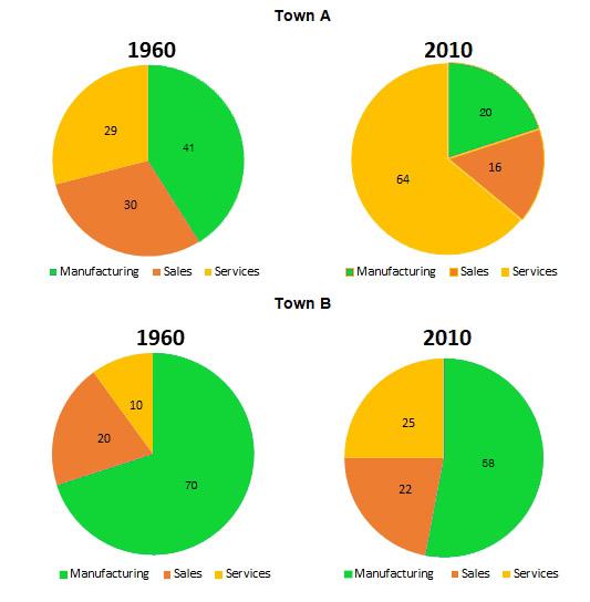
The provided four pie charts discuss the changes in the workforce breakdown between 1960 and 2010 in
town
A and Use synonyms
town
Use synonyms
B
. Use synonyms
This
essay aims to summarize the differences observed during Linking Words
this
period in both towns.
In Linking Words
town
A, there was a substantial decrease in the percentage of workers employed in the manufacturing and sales sectors, amounting to almost half. Use synonyms
In contrast
, the services Linking Words
sector
experienced a significant increase, approximately doubling its manpower. Use synonyms
On the other hand
, Linking Words
town
Use synonyms
B
displayed a different trend. The manufacturing Use synonyms
sector
saw a decline of 12% in its workforce, Use synonyms
while
the services Linking Words
sector
witnessed a rise of 15%. The sales Use synonyms
sector
in Use synonyms
town
Use synonyms
B
only experienced a slight growth of around 2%.
Use synonyms
Overall
, there was a notable decrease in most sectors of Linking Words
town
A, except for the manufacturing Use synonyms
sector
, which thrived. Use synonyms
Conversely
, Linking Words
town
Use synonyms
B
did not witness significant changes. Manufacturing remained the dominant Use synonyms
sector
in Use synonyms
town
Use synonyms
B
, Use synonyms
while
the services Linking Words
sector
experienced similar improvements as in Use synonyms
town
A.Use synonyms