The pie chart below shows the percentage of ad spending by different kinds of media in India from 2012 to 2017.

The pie chart below shows the percentage of ad spending by different kinds of media in India from 2012 to 2017.
The
given
Verb problem
apply
show examples
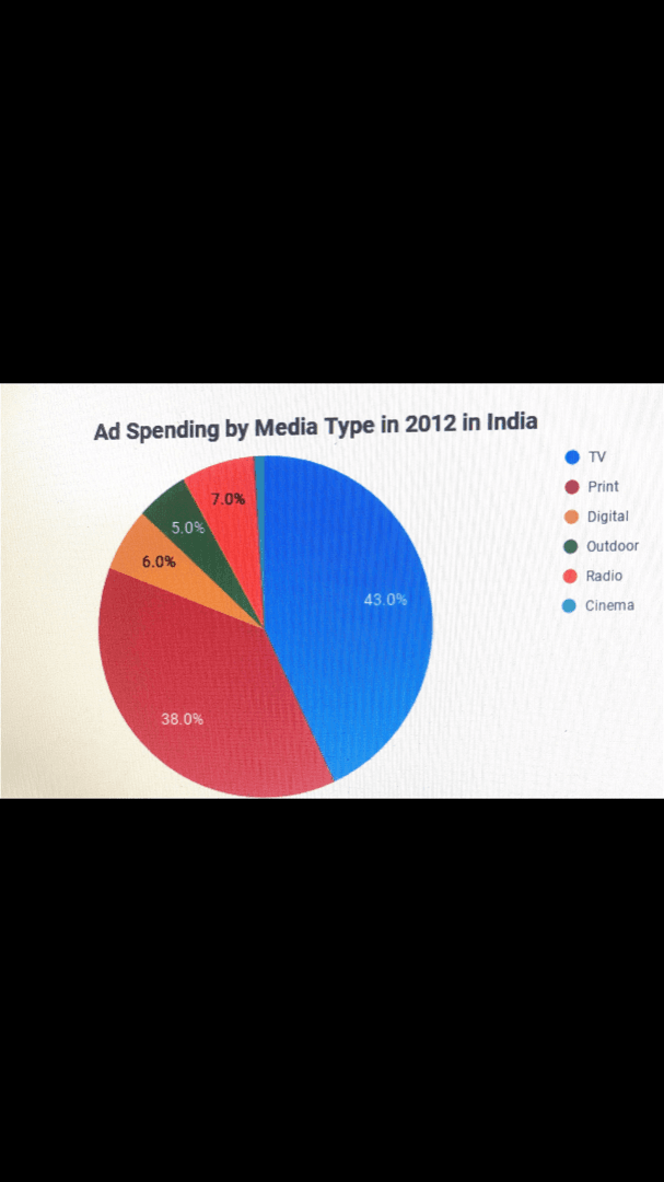
pie chart illustrates a detailed comparison of ad spending media in India from 2012 to 2017. During the
5 year
Add a hyphen
5-year
show examples
period, the percentage for the TV had slightly increased from 43 to 45 and remained the largest media. For print,in 2012 percentage peaked
in
Change preposition
at
show examples
38 and
then
fell to 30 in 2017. Ad percentage for digital increased over
this
time, from 6 to 15. Two categories that stayed unchanged were outdoor, which was 5 and cinema, which was 1.
Overall
the changes in commercials were not greatly distinctive from
2012
Correct article usage
the 2012
show examples
to 2017 academic writing chart
Submitted by tukezaliyeva96 on

Unauthorized use and/or duplication of this material without express and written permission from this site’s author and/or owner is strictly prohibited. Excerpts and links may be used, provided that full and clear credit is given to Writing9 with appropriate and specific direction to the original content.

Sentences: Add more complex sentences.
Basic structure: Write more paragraphs.
Basic structure: Add more body paragraphs.
Common mistake: Your writing should be 150-250 words.
Basic structure: Write more paragraphs.
Vocabulary: The word "chart" was used 2 times.
Vocabulary: The word "percentage" was used 3 times.
Vocabulary: The word "increased" was used 2 times.
What to do next:
Look at other essays: