
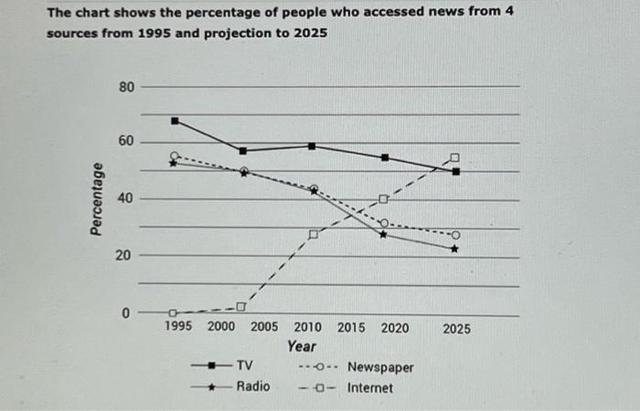
The provided diagram below illustrates the proportions of four different sources to access the news over 30-year periods.
Overall
, the histogram demonstrates the downfall trend of three alternative sources which are TV, newspaper and radio. The years are taken into consideration starting from 1995 to the end of the period time of 2025.
Observing the details, it is remarkable that TV was on a peak at 78% in 1995 and experienced fluctuations in 2000 Linking Words
then
fell to approximately 50% in 2025. Linking Words
Similarly
, newspaper and radio which remained roughly at 50-55% in 1995 Linking Words
then
encountered the reduction in 2000 and reached the lowest level around 25-30% in 2025.
Linking Words
On the contrary
, the Internet which was the only source started at 0% in 1995. Noticeably, people who spent time on the internet to access the news dramatically increased in 2010 to 30% and reached its peak of 65% throughout the reporting period.Linking Words