
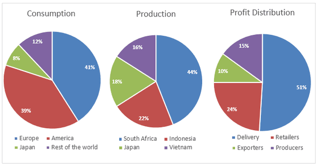
The pie charts illustrate differences in global coffee consumption, the leading four countries in the world when it comes to producing caffeine, and how its income has been distributed all over the world.
It is noticeable that coffee intake accounted for 41% in Europe, followed by Americans with 39%.
Moreover
, the percentages of Japan and the rest of the world are about 20%, which is about half of the consumption done by Americans.
On the one hand, Indonesia appeared to be the largest espresso producer, Linking Words
whereas
South Africa continued to be the dominant producer for around 44% when it doubled compared to Indonesia. Both Vietnam and Japan have statistics of 16% and 18%, respectively.
Linking Words
On the other hand
, most of the harvest comes from the delivery of coffee, which is approximately half of the total survey. Linking Words
Additionally
, the figure for retailers accounts for 24%, Linking Words
while
the remaining profit is divided among exporters and producers at 10% and 15%, respectively.Linking Words