
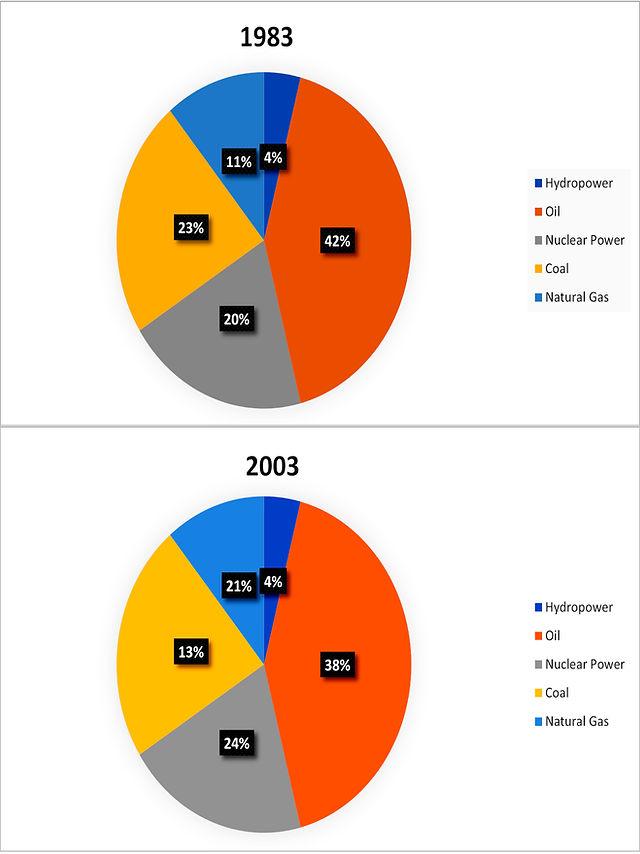
The pie graphs depict information about the different types of
Use synonyms
energy producing
percentages from a country over a 20-year period, starting from 1983.
Add a hyphen
energy-producing
Overall
, it can be seen that the highest amount of Linking Words
energy
produced from the oil than any other. Use synonyms
Further
, Hydropower stood Linking Words
same
from the beginning.
Looking at the data sets in more detail, it is evident that the percentage of hydropower released Correct article usage
the same
competitively
lower than any other Add a missing verb
was competitively
energy
source, which is 4% and remained Use synonyms
same
both in 1983 and 2003. Correct article usage
the same
However
, the proportions of Oil Linking Words
energy
generated 42% in 1983, Use synonyms
whereas
it decreased to 38% in 2003 but created the most amount of Linking Words
energy
among others.
Turning to the remaining data sets in more detail, it is shown that Nuclear power increased from 1983 to 2003, at about 20% to 24%. The figure for the Coal Use synonyms
energy
decreased its production proportions, from 23% in 1983 to 13% in 2003. Use synonyms
Last
but not least, Natural Gas rose dramatically from 11% to 20% within 20 years.Linking Words