
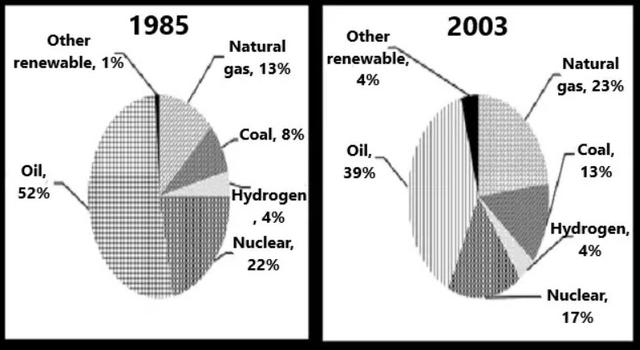
The two pie charts illustrate
,
the proportion of generation of power from six different types of natural sources of energy in a state between 1985 and 2003.
Remove the comma
apply
Overall
, Linking Words
it is clear that
the maximum portion of energy is derived from oil followed by Nuclear and natural Linking Words
gas
. On the other side, the rest percentage of power generated from coal,hydrogen and other renewable sources.
In terms of oil, nuclear and natural Use synonyms
gas
usage, which comprise the maximum portion of usage; the use of oil and natural Use synonyms
gas
reduced over the period from 52% to 39% and from 22% to 17%, respectively. Use synonyms
However
, the use of natural Linking Words
gas
increased from 13% in 1985 to 23% in 2003.
Use synonyms
On the other hand
, the rest of the sources show quite a different trend during the years. The consumption of coal increased by 5%, starting from 8% in 1985 to 13% in 2003. Linking Words
Moreover
, the use of other renewable increased by 3% Linking Words
at the end
of the period. Linking Words
Nevertheless
, the generation of energy using hydrogen remained unchanged (4%) throughout the years.Linking Words