
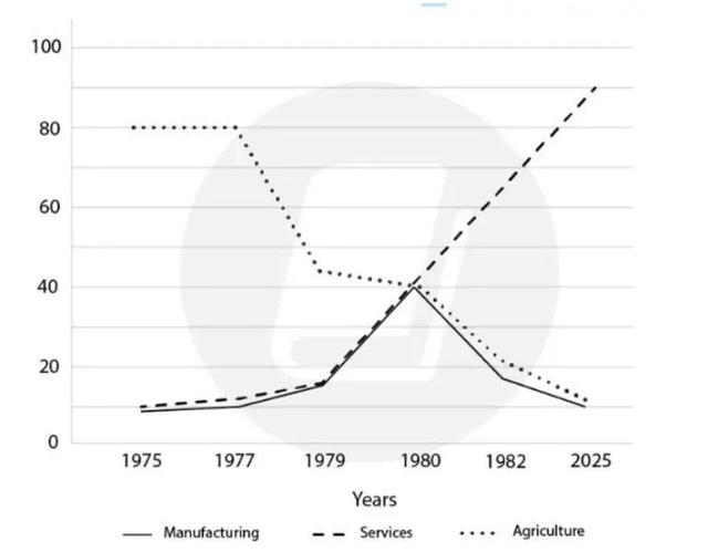
The line graph compares the
figure
of Fix the agreement mistake
figures
people
in the USA who worked in different sectors from 1975 to 2025.
It can be observed from the line graph that the Use synonyms
number
of Use synonyms
people
engaged in the agriculture Use synonyms
sector
decreased over a period of 50 years. In 1975, the majority of Use synonyms
people
chose the agriculture Use synonyms
sector
, with approximately 80 Use synonyms
million
. The figure remained stable until 1977. In the following years, the Use synonyms
number
of Use synonyms
people
fell dramatically to around 10 Use synonyms
million
.
Use synonyms
By contrast
, there were around 10 Linking Words
million
Use synonyms
people
employed in the service Use synonyms
sector
in 1975. By 2025, the Use synonyms
number
of Use synonyms
people
working in the service Use synonyms
sector
had increased steadily to 90 Use synonyms
million
.
Use synonyms
On the other hand
, the figure of Linking Words
people
who worked in the manufacturing Use synonyms
sector
was consistently lower than others. Use synonyms
This
Linking Words
number
Use synonyms
also
rose steadily until 1980, and Linking Words
then
rapidly declined to 10 Linking Words
million
over the following 45 years. Use synonyms
In addition
, every Linking Words
sector
had the same quantities in 1980, around 40 Use synonyms
million
.Use synonyms