
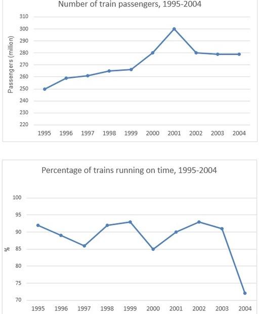
The line graphs provide information about the number of caravan passengers in Sydney and the percentage of convoys which run on time. The X-axis shows the years and the Y-axis depicts the number of train passengers and the percentage of caravans running on time.
Overall
, what stands out from the graphs is that though there was an increasing trend of train travellers, the proportion of trains which ran on time had a decreasing trend. The most interesting point is that the percentage of on-time running of Linking Words
this
transport was the same in 1999 and 2002.
From 1995 to 1999 there was a gradual increase in the number of passengers on trains from 250 to 267. Linking Words
Then
it rocketed to 300 in 2001. Before levelling off at around 280 from 2002 to 2004, it plummeted from 300.
In 1999, the figure for the appropriate timing of trains was 92 per cent. From that year, the trend decreased and reached 86 in 2001. Though there was some fluctuation, from 2003 to 2004, the figure decreased dramatically from 91 to 72 per cent.Linking Words