
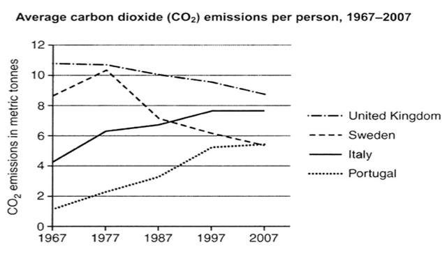
The line graph illustrates the average individual emissions in the selective European countries, namely the United Kingdom, Sweden, Italy, and Portugal. The graph captures carbon dioxide data from 1967 to 2007. It can be seen that there are two distinctive patterns of carbon production from these two countries. Sweden and the United Kingdom committed to reducing CO2 by the end of the period,
while
Italy and Portugal were experiencing a gradual increase.
The UK people has the highest pollution generated by its citizens with around 11 metric Linking Words
tonnes
per person in 1967. Even with the reduction to around 9 metric Use synonyms
tonnes
in 2007, the UK still maintained its position. A similar trend happened with SwedishUse synonyms
,
but with greater impact. Once became the second highest emissions, even peaking at more than 10 metric Remove the comma
apply
tonnes
in 1977, Sweden's pollution declined significantly until it reached the same position as Portuguese.
Portugal citizens ranked the least amount of CO2 production in 1967, Use synonyms
however
the metrics were growing until 2007 when they had the same amount of emissions as Swedish with almost 6 metric Linking Words
tonnes
. Italy experienced the worst pattern of all of the countries mentioned. Starting with 4 metric Use synonyms
tonnes
per individual, Italians created higher CO2 since that period until peaked at almost double that production in the first period.Use synonyms