
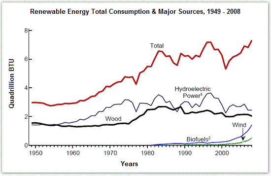
The line graph compares the consumption of four different sources of renewable energy in the US from 1949 to 2008, measured in
Quadrillion
Use synonyms
BTU
.
Use synonyms
It is clear that
the total consumption of renewable energy increased significantly over the period, with Hydroelectric Linking Words
Power
being the most popular source. Use synonyms
However
, there were Linking Words
also
some variations and contrasts in the trends of each source.
In 1950, Hydroelectric Linking Words
Power
and Wood accounted for nearly 2 Use synonyms
Quadrillion
Use synonyms
BTU
each, Use synonyms
while
Biofuel and Wind were negligible. Over the next two decades, Hydroelectric Linking Words
Power
increased slightly to about 3 Use synonyms
Quadrillion
Use synonyms
BTU
, Use synonyms
while
Wood remained stable. From 1970 to 2000, Hydroelectric Linking Words
Power
fluctuated between 3 and 4, before dropping to just over 2 in 2008. Wood, Use synonyms
on the other hand
, rose gradually to about 3 in 1989, and Linking Words
then
fell steadily to around 2 by the end of the period.
Linking Words
In contrast
, Biofuel and Wind only started to be consumed from 1980 onwards, with very low amounts. Between 1980 and 2000, both sources grew slowly to less than 0.5 Linking Words
Quadrillion
Use synonyms
BTU
. Use synonyms
However
, after 2000, Biofuel surged dramatically to almost 2 in 2008, Linking Words
while
Wind peaked at less than 0.5 in the same year.Linking Words