
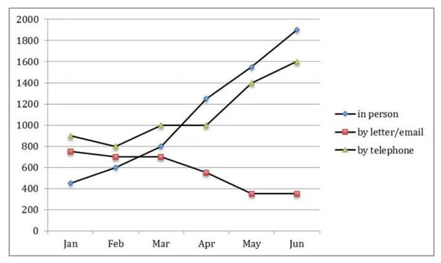
The diagram provides the total
people
number that inquiring about information at the UK tourist offices in the first half of the observed year.
Use synonyms
Overall
, the line graph shows the numeric data of enquiry sources, Linking Words
such
as in person, by letter or email, and by telephone, on a monthly basis from January to June. Linking Words
While
the sum of Linking Words
people
that asked for the information kept decreasing, the other two ways are showing a strong positive trend.
In January, almost 500 citizens went to the tourist offices directly to gain the info and it was the least number in comparison to contacting by telephone (approximately 750) and by letter or email (more than 800). Use synonyms
However
, in the next six months, the statistics kept increasing to almost 5x (nearly 2000 Linking Words
people
). Use synonyms
In addition
to that, the same trend is shown by phone inquiries to 1600 requests. In contrary to that, Linking Words
people
started to leave the mail option and decreased to more than half to less than 400 enquiries.Use synonyms