
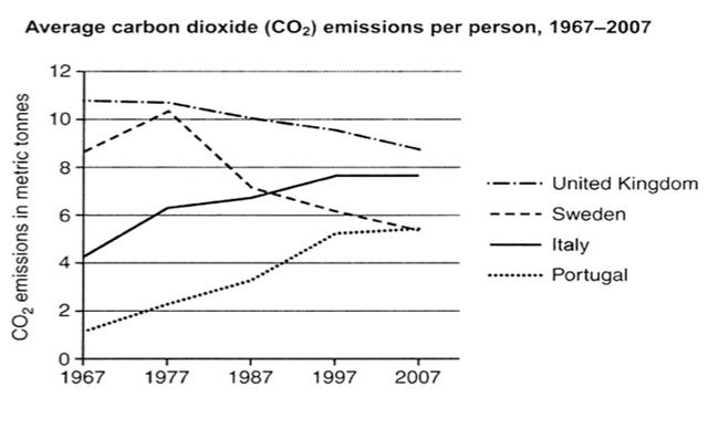
The line graph illustrates the average carbon dioxide (CO2) emissions of each person in the four different countries from 1967 to 2007.
After Analyzing,
firstly
beginning with the two countries that had increased CO2 emissions. Portugal started from less than 2 metric Linking Words
tonnes
per individual in 1967 and rapidly increased in 2007 reaching almost in metric Use synonyms
tonnes
. Use synonyms
Similarly
, Italy has grown from nearly 4 metric Linking Words
tonnes
in 1967 and nearly ended in almost 8 metric Use synonyms
tonnes
.
Use synonyms
Secondly
, with the other two countries that have an upward trend. Sweden started from more than 8 metric Linking Words
tonnes
at the beginning of the period and reached its peak of over 10 units in 1997 and the decreased units in 2007 becoming over a bit almost 6 metric Use synonyms
tonnes
. The UK has continuously decreased in the given period from nearly 11 metric Use synonyms
tonnes
to less than almost 10 metric Use synonyms
tonnes
in 2007.Use synonyms