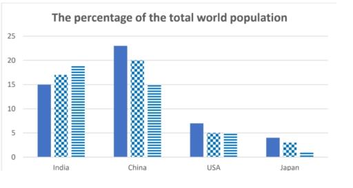
The bar chart shows the percentage of the total world population in 4 countries in 1950 and 2002, and projections for 2050. Summarise the information by selecting and reporting the main features and make comparisons where relevant.
IELTS Writing Task Chart for The bar chart shows the percentage of the total world population in 4 countries in 1950 and 2002, and projections for 2050. Summarise the information by selecting and reporting the main features and make comparisons where relevant.
the ratio of overseas population in certain countries
are
Unnecessary verb
apply
show examples
India, China,
Usa
Correct your spelling
USA
and Japan from 1950 to 2000 with
expectation
Fix the agreement mistake
expectations
show examples
in
Change preposition
for
show examples
2050.
M
Unauthorized use and/or duplication of this material without express and written permission from this site's author and/or owner is strictly prohibited. Excerpts and links may be used, provided that full and clear credit is given to Writing9 with appropriate and specific direction to the original content.
Sentences: Add more complex sentences.
▼
Linking words: Add some linking words.
▼
Linking words: Add linking words.
▼
Introduction: The introduction is missing.
▼
Introduction: Change the first sentence in the introduction.
▼
Introduction: The chart intro is missing.
▼
Basic structure: Write more paragraphs.
▼
Basic structure: Add more body paragraphs.
▼
Common mistake: Your writing should be 150-250 words.
Introduction: The chart intro is missing.
▼
Basic structure: Write more paragraphs.
▼
Vocabulary: Only 2 basic words for charts were used.
Nowadays, many people believe that children face more pressure from society than they did in the past. I completely agree with this opinion. In my view, the rise of technology has added more stress to children’s lives, especially in terms of social life, health, and education.
Youngsters are the backbone of every economy. A part of society believes that young people should take part in some voluntary work for the welfare of society while, others reject this notion. Honestly, I partially agree with the above testimonial. Therefore, I will explicate the reasons behind this viewpoint in upcoming paragraphs thus will lead to a logical conclusion as well.
It has become common for almost all levels of school to have regular sports competitions, mostly between schools. Although some support this event and argue that it has benefits, others strongly oppose it due to its associated negative consequences. The following essay will examine these perspectives before giving a personal opinion.
There has been an increasing trend to date regarding increased ownership over the design and construction of different buildings such as houses and offices. There are numerous downsides to this trend, however, I believe the advantages greatly outweigh the bad.
I am writing regarding some issues I have with the student I am sharing my dorm room. I live in room number 1211 on the first floor of Block A, and I share the accommodation with another student, Mary Jose. My roommate has not been following some ground rules set by the campus, and it has been very difficult for me to focus on work.