
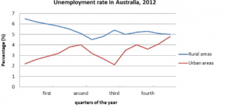
The given line graph illustrates the unemployment rate of Australians in 2012.
Overall
, It can be seen that the number of people who did not work in rural Linking Words
areas
is higher than in urban Use synonyms
areas
. There was a decline Use synonyms
of
unemployed inhabitants in villages, Change preposition
in
however
, for the cities it was the opposite during the period of time.
Linking Words
To begin
with, the figure of jobless citizens in rural Linking Words
areas
, which was almost 7%, had a dramatic decline and reached the lowest point (less than 5%) by the end of the second quarter. For the next two quarters, there were some fluctuations and the number of unemployed people accounted for 5%.
Use synonyms
On the other hand
, urban Linking Words
areas
’ rate of workless residents began from just over 2% and had a sharp growth over half a year. Use synonyms
This
number decreased to the previous point during three months and for the remaining time, it rose and hit a peak of approximately 5%, which was almost the same as for the rural Linking Words
areas
.Use synonyms