
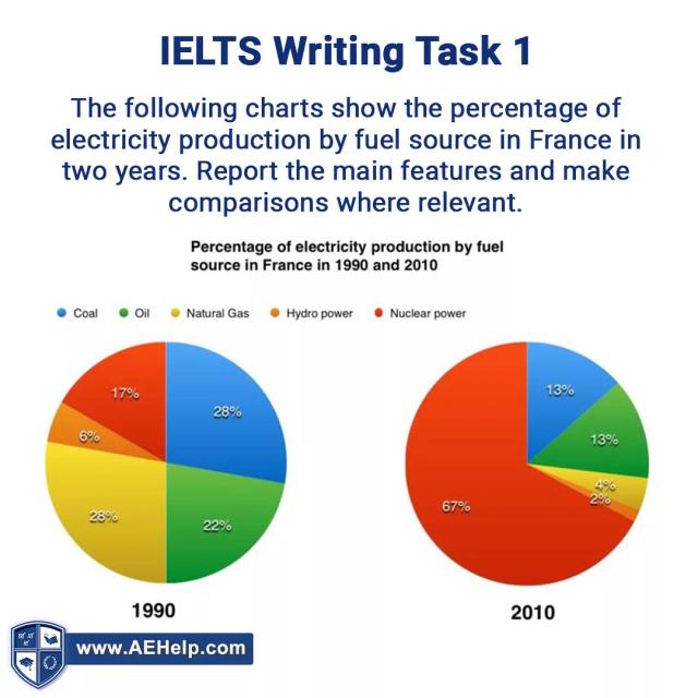
The two pie charts give information about the amount of electricity construction by fossil fuel in France during the two decades starting from 1990.
Overall
, Linking Words
it is clear that
at the beginning of the period, natural gas and coal were the largest segments Linking Words
while
the average slice was oil. Linking Words
Conversely
, Linking Words
at the end
of the time nuclear power became the most important division and the manufacturing of hydropower was the Linking Words
last
piece.
Focusing on Natural gas and Coal, Natural gas comprised 28% in the first year and Linking Words
this
showed a sharp decrease of 24% to 4% and Coal went down suddenly from 28% to 13%. Linking Words
Likewise
, in 1990 oil used 22% which fell rapidly to 13% 20 years later.
With regard to the Linking Words
overall
rate of Nuclear power, there was approximately a 50% rise till 2010. Linking Words
On the other hand
, hydropower declined slightly from 6% to 2% Linking Words
at the end
of the time.Linking Words