
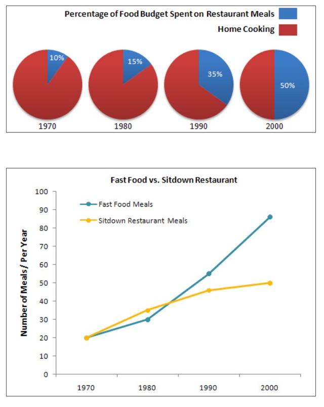
These pie charts depict per cent of the average money spent by some families over 30 years.
Linking Words
While the
line graph depicts a comparison between fast food and general restaurants for the number of Correct word choice
The
meals
consumed from 1970 to 2000. It is clear from the graphs that the proportion of home Use synonyms
meals
dropped rapidly until it reached 50% in 2000. At the same moment, restaurant Use synonyms
meals
increased to half of the consumption. Use synonyms
In addition
, both fast food and general Linking Words
meals
rose gradually for the whole period.
Use synonyms
According to
what is shown in the pie charts, from 1980 to 1990 home cooking decreased by 20 per cent to 65%. Linking Words
Then
, there was a slight descent in 1990 by 15%. Linking Words
However
, it reached the lowest point at 50% which was a similar rate to taking Linking Words
meals
at restaurants.
As can be seen in the line graph, both fast food and sit-down restaurant Use synonyms
meals
went up, and they got the same number of Use synonyms
meals
in 1985 approximately 40%. Use synonyms
Moreover
, they increased dramatically to reach about 85% and 50% respectively in 2000.Linking Words