
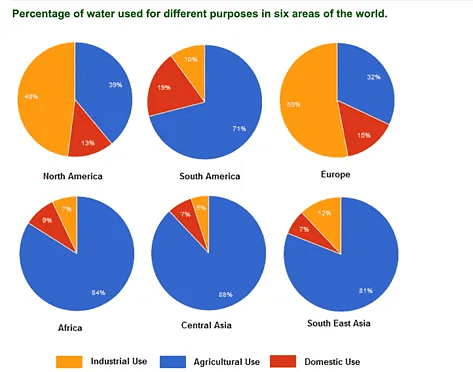
The pie charts shown illustrate the comparison of the percentage of
water
consumption for several purposes around the world. It can be seen that most regions mostly use Use synonyms
water
for their agricultural needs.
Several regions, namely South Use synonyms
America
, Africa, Central Asia, and South East Asia, need Use synonyms
water
mostly for their agricultural system ranging from 71% to 84%. Meanwhile, in North Use synonyms
America
, nearly two-fifths of the Use synonyms
water
go to Use synonyms
their
agricultural industry and about one-third of the Change the word
the
water
in Europe goes to the same use.
In most of the area, Use synonyms
water
for domestic use is not too high, ranging from 7% to almost Use synonyms
one-fifths
of the Correct your spelling
one-fifth
overall
percentage in South Linking Words
America
. The industrial need for Use synonyms
water
, Use synonyms
however
, showed the most prominent wants in North Linking Words
America
and Europe with around half of the Use synonyms
overall
needs.Linking Words