
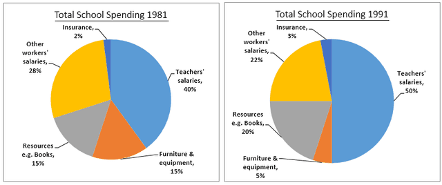
Three pie charts compare the amount of money changes in a specific school in the UK per year in 1981, 1991, and 2002.
Three pie charts below shows the changes in annual spending by a particular UK schools in 1981, 1991 and 2002. Summarise the informatin by selecting and reporting the main featrures, and make comparisons where relevant.
✍️ Want to check your own essay?Get started →
Unauthorized use and/or duplication of this material without express and written permission from this site's author and/or owner is strictly prohibited. Excerpts and links may be used, provided that full and clear credit is given to Writing9 with appropriate and specific direction to the original content.
Sentences: Add more complex sentences.
▼
Linking words: Add some linking words.
▼
Linking words: Add linking words.
▼
Basic structure: Write more paragraphs.
▼
Basic structure: Add more body paragraphs.
▼
Common mistake: Your writing should be 150-250 words.
Basic structure: Write more paragraphs.
▼
Vocabulary: Only 4 basic words for charts were used.
▼