
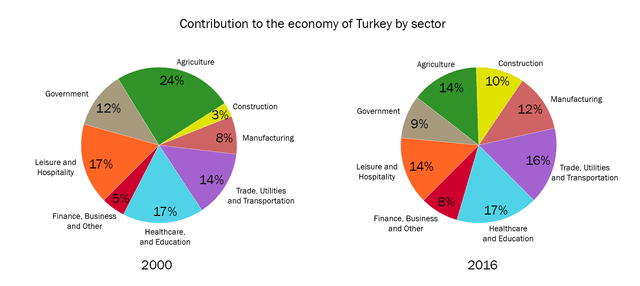
The pie charts display to make a comparison of the economy by different sectors
such
as Linking Words
agriculture
, construction, manufacturing, trade, healthcare, business, hospitality, and government between 2000 and 2016.
Use synonyms
Overall
, most of the categories illustrated a modest change in the percentages in the economics of those features in those years. Linking Words
Moreover
, the significant change was in Linking Words
agriculture
, since Use synonyms
this
category dropped a small minority in 2016, highlighting healthcare and education which keep the same data.
In 2000 the major percentage was in Linking Words
agriculture
, after hospitality, and government. The lowest was in construction, following finance and manufacturing with an insignificant minority.
Use synonyms
In addition
, in 2016 the piece show a big chance in comparison with the data in 2000, since Linking Words
agriculture
went down by 10% less and construction kept the same analysis, Use synonyms
as well as
the categories that were with minimum percentages, rising little by little.Linking Words