The bar graph below shows the amount of carbon emissions in different countries during three different years. Summarise the information by selecting and reporting the main features, and make comparisons where relevant.

The bar graph below shows the amount of carbon emissions in different countries during three different years. Summarise the information by selecting and reporting the main features, and make comparisons where relevant.
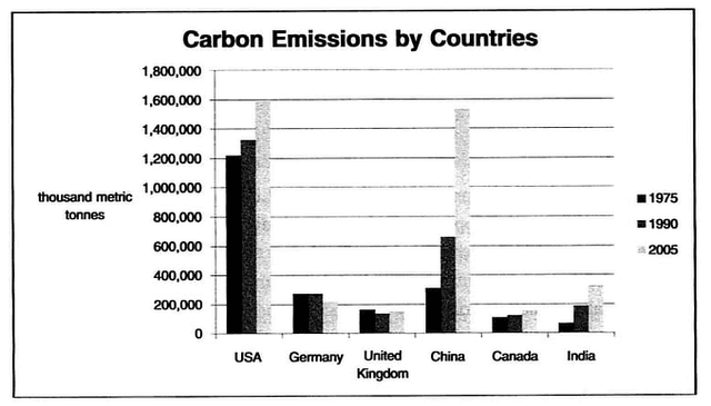
The bar graph below demonstrates the amount of carbon emission in the
USA
, Germany, UK, China,
Canada
and India during three various years. As you can see
it is clear that
the greatest among are
blonge
Correct your spelling
blonde
to the
USA
and China in 2005.
According to
the graph, the
USA
in 2005 had the
most
Correct word choice
highest
show examples
amount
about
Change preposition
apply
show examples
1, 600, 000.
Also
, Germany in 1975 and 1990 had the same amount nearly 300, 000.
In addition
, It is obvious that all the 6 countries except the
USA
have the
least
Correct word choice
lowest
show examples
among in 1975 and 1990.
Furthermore
, As you
can
Verb problem
apply
show examples
know
Canada
had the fewest among in during 3 several years.
Also
, In 2005
Canada
and the UK
has
Wrong verb form
had
show examples
same
Correct article usage
the same
show examples
among about 150, 000.
Moreover
, In 1975 India had the fewest among approximately 10, 000,
while
the United States of America had the most among in 1975. In conclusion,
Canada
has the fewest among in during 3 different years,
while
the
USA
have the greatest among.
Submitted by bazarjanimohammadreza83 on

Unauthorized use and/or duplication of this material without express and written permission from this site’s author and/or owner is strictly prohibited. Excerpts and links may be used, provided that full and clear credit is given to Writing9 with appropriate and specific direction to the original content.

Sentences: Add more complex sentences.
Linking words: Don't use the same linking words: "also, while".
Introduction: The introduction is missing.
Introduction: Change the first sentence in the introduction.
Introduction: The chart intro is missing.
Basic structure: Change the third paragraph.
Introduction: The chart intro is missing.
Vocabulary: Replace the words usa, canada with synonyms.
Vocabulary: Rephrase the word "amount" in your introduction.
Vocabulary: Only 5 basic words for charts were used.
Vocabulary: The word "graph" was used 2 times.
Vocabulary: The word "amount" was used 3 times.
Vocabulary: The word "about" was used 2 times.
Vocabulary: Use several vocabularies to present the data in the third paragraph.
Topic Vocabulary:
  • carbon emissions
  • bar graph
  • trends
  • analyze
  • significant changes
  • emission levels
  • steady increase/decrease
  • comparisons
  • summarize
  • range
  • over time
  • environmental impact
  • greenhouse gases
  • sustainable practices
  • fossil fuels
  • industrial activity
  • data interpretation
  • chart analysis
  • megatons
  • climate change
What to do next:
Look at other essays: