
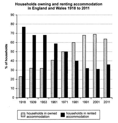
The bar chart presents the data on the proportion of privately owned houses versus rented properties in England and Wales regions within almost the century date range starting from 1918 to 2011.
Overall
, the leased accommodations steadily decreased whilst the private properties volume demonstrated the opposite increase. Linking Words
At the end
of the period, the percentage of rented houses slightly rose up Linking Words
in contrast
the owned ones were dropped off. Notably, in the middle of the study range, there was a period when residential accessibility was the same for everyone.
Linking Words
Firstly
, at the beginning of the 20th century, about 80 % of the accommodations were let and only 20 % of dwellings had found their real owners. Over time, the situations gradually changed. Linking Words
As a result
, we faced a completely opposite picture and a significant gap between those datasets in 2011. Having said that, only 35 % had the apartment leased and nearly 65 % became private property.
Linking Words
Secondly
, the household categories ratio had the same value of 50 % each. From 1966 to 1976 no shifts were noticed but it was a breaking point where the private property numbers started to grow, and the next decades illustrate the approximate 20 % augmented difference between categories.Linking Words