The graph below shows the amount of foods transported in the UK from 1974 to 2002.

The graph below shows the amount of foods transported in the UK from 1974 to 2002.
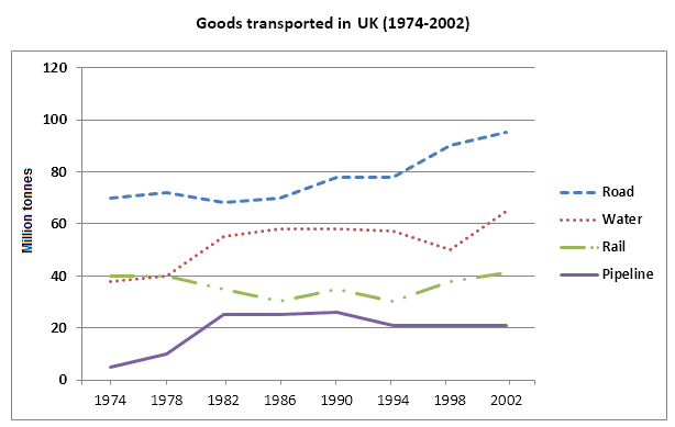
The given line graph illustrates how much good was transported in the UK over a period of 28 years between 1974 and 2002. Units are measured in Million tonnes.
Overall
, it can be seen that over the given period, the highest amount of goods transported by road transportation
while
pipeline shows the lowest level. Water and Rail transportation
also
indicate a high amount of transportation.
Submitted by Deddymus on

Unauthorized use and/or duplication of this material without express and written permission from this site’s author and/or owner is strictly prohibited. Excerpts and links may be used, provided that full and clear credit is given to Writing9 with appropriate and specific direction to the original content.

Basic structure: Write more paragraphs.
Basic structure: Add more body paragraphs.
Common mistake: Your writing should be 150-250 words.
Basic structure: Write more paragraphs.
Vocabulary: Only 6 basic words for charts were used.
Vocabulary: The word "give" was used 2 times.
Vocabulary: The word "amount" was used 2 times.
What to do next:
Look at other essays: