
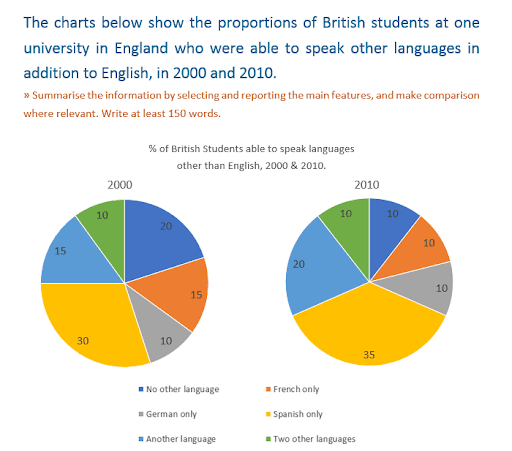
The pie chart illustrates the percentage of British students who can speak languages other than English.
Overall
it can be seen that the number of people who speak Spanish was the biggest throughout the period.
Looking at the data sets in more detail it can be noticed that the number of Spanish speakers was 30% of people in 2000 and 35% of students in 2010, which was the largest in the graph. Linking Words
In addition
, there was 10% of German speakers both in 2000 and 2010. Linking Words
Moreover
, the amount of students, who speak one or two other languages both accelerated by 5 in 2010. As follows, 15% of one another language users increased to 20% and 10% of children who speak two languages to 15% in the next 10 years. Linking Words
However
, the number of children, who use only English decreased. Linking Words
In other words
, there were 20% in 2000 and 10% in 2010. Linking Words
Furthermore
, the percentage of French speakers Linking Words
also
declined. There were 15% in 2000 and 10% in 2010.Linking Words