
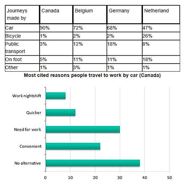
The given table illustrates information about the ratio of travel which is made by different transport ways in four territories and the bar graph
also
provides data related to the consequence of a survey on car use.
Linking Words
Overall
, it can be seen that people prefer their cars Linking Words
instead
of other environmentally friendly items Linking Words
while
the Netherlands is the only country where its percentage is divided into all five pieces acceptably and regarding the column chart it is obvious that folks choose their vehicles because they do not have any other alternatives.
Looking at the details, in Canada, Germany and Belgium driving the car proportions were from 68% to 90% and the interest related to public wheels was under 20% and only 2% of nations ride a bike Linking Words
whereas
in the Netherlands, society use the car with 47% and the rates of the bicycle are 26% and interestingly, 18% of folks took a walk.
Regarding the diagram, the portion of having no alternative was 38% and it was followed by eight low per cent related to the need for work Linking Words
following
Linking Words
this
, the correlation of convenience was over 20% and the remaining two items' percentages are halved with nearly one-tenth.Linking Words