
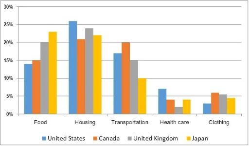
The provided bar chart illustrates the the expenditure of people from five different countries, the USA, Canada, the UK, and Japan in the year 2009. The data is given in percentages and it can be split into two trends, upward and downward trends. In general, all of the residents from five countries spent most of their money on housing items, and less on health care.
First of all, people spend a lot of their salaries on food, housing, transportation,healthcare, and clothing. Housing goods tended to be the most popular items that families from all nations needed.
According to
the American record, there was over 25% Linking Words
of
buy household stuff, followed by the rest countries, roughly over 20%. Change preposition
apply
Furthermore
, the cost of food, was in a position too, the highest payment of spending goes to Japanese, merely 23%, and others accounted for 15%-20% of eating the cost. Linking Words
Moreover
, the vehicle price that has been used by the population in different nations was roughly in the middle of the graph by 10%-20% respectively.
Linking Words
In contrast
, the less popular trend of the expenses was health care and clothing items. Linking Words
Due to
the bar chart, both of these two were stood at a low level, which was less than 10%.Linking Words