
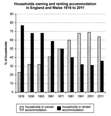
The graph illustrates the households in owned and rented accommodation in England and Wales between the time period of 1918 and 2011.
Overall
, the major difference between 1918 and 2011 is the households in rented accommodation decreased in 2011 and owned accommodation increased by 65%.
Linking Words
However
, in 1918 the number of owned houses was less than only 23% but the counting of rented families was more than 65%. Linking Words
Also
, in the next 21 years, the count of owned land bloomed to 32 per cent Linking Words
as well as
the rented house is 68%. Linking Words
Furthermore
, the number continuously decreasing of rental apartments and in 1971, the constant stage arrived where the percentage of households was the same at 50%. From Linking Words
this
turnover, the rental infrastructure has vigorously declined.
Linking Words
Moreover
, in 1981 the families living in their own apartments were 60% and in rental apartments 32% . Between 1991 and 2001, the quantity of rented buildings was almost the same more than 30% Linking Words
along with
the quantity of self building being more than 70%. By the end of 2011, the quantity of owned lands rather than rentals is more than 30%.Linking Words