
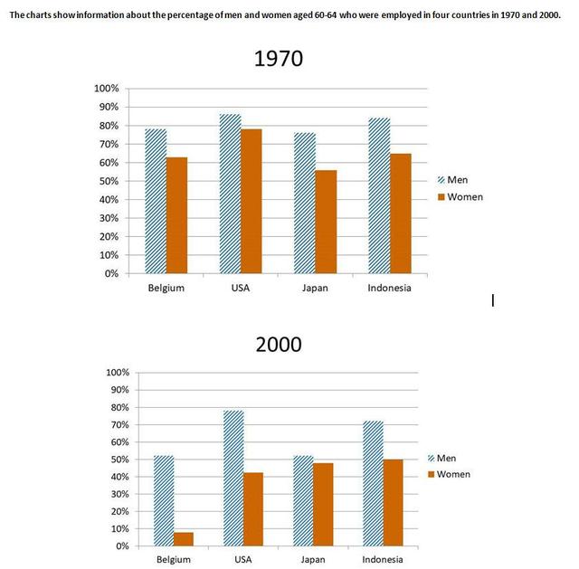
The given two charts demonstrate the data about the proportion of females and males whose ages changed between 60 and 64
as well as
those who were employed in various four countries in 1970 and 2000.
Linking Words
Overall
, it is evident from the graph that the rates of the USA had the highest share for both genders in 1970 above 70% Linking Words
while
the percentage of both men and women ranked the lowest amount in Belgium in 2000, Linking Words
also
the proportion of men was the same number in Japan.
Looking at the details, the contributions of women were above 50% in 1970 Linking Words
whereas
the pattern followed a descent and collapsed under 50% in the next 30 years. Linking Words
Furthermore
, the share of Indonesia for men reported between 80-90% and above 70% in 1970 and 2000, respectively. Linking Words
Moreover
, the preference for females in Belgium was the leader with approximately 63% in 1970 among other countries compared with the year 2000 it did not experience the same tendency and declined to under 10%. The indicators of Japan accounted for nearly 72% and above 50% of males in 1970 and 2000, respectively.Linking Words