The first chart below shows the energy is used in an average Australian household. The second chart shows the greenhouse gas emissions which result from this energy use. Summarise the information by selecting and reporting the main features, and make comparisons where relevant.

The first chart below shows the energy is used in an average Australian household. The second chart shows the greenhouse gas emissions which result from this energy use. Summarise the information by selecting and reporting the main features, and make comparisons where relevant.
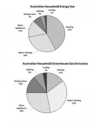
The following illustrations depict the
energy
consumption in an average Australian household and the percentage of greenhouse gas
emissions
that those appliances produce.
Overall
, Australians use the majority of
the
Change the word
their
show examples
energy
on
the
Correct article usage
apply
show examples
heating and the least
amount
of
energy
on cooling. The
amount
of greenhouse gas
emissions
is produced because of water heating unlike and the least
amount
of the
emissions
that is
produced from cooling. The biggest fraction of the used
energy
is from heating, it made up almost half of the pie chart. Water heating consumes a lot of
energy
, too. Australian people spend the least
amount
of
energy
on cooling, lighting and refrigeration
according to
the pie chart. The highest percentage of greenhouse gas
emissions
is produced by water heating and other appliances. Heating and refrigeration result in almost the same percentage of
emmisions
Correct your spelling
emissions
which is around 15%. Cooling and lighting together make up only
one tenth
Add a hyphen
one-tenth
show examples
of the pie chart.
Submitted by intiqam.hasanov on

Unauthorized use and/or duplication of this material without express and written permission from this site’s author and/or owner is strictly prohibited. Excerpts and links may be used, provided that full and clear credit is given to Writing9 with appropriate and specific direction to the original content.

Introduction: The introduction is missing.
Introduction: The chart intro is missing.
Vocabulary: Replace the words energy, emissions, amount with synonyms.
Vocabulary: Only 6 basic words for charts were used.
Vocabulary: The word "chart" was used 3 times.
Vocabulary: The word "amount" was used 4 times.
Vocabulary: The word "percentage" was used 3 times.
Vocabulary: The word "almost" was used 2 times.
Topic Vocabulary:
  • Average Australian household
  • Greenhouse gas emissions
  • Energy consumption
  • Activities
  • Heating
  • Cooling
  • Water heating
  • Appliances
  • Lighting
  • Standby
  • Percentage (%)
  • Consumption patterns
  • Efficiency
  • Emissions impact
  • Renewable energy
  • Energy-saving measures
  • Sustainability
  • Carbon footprint
  • Electricity
  • Natural gas
  • Emissions breakdown
  • Energy audit
  • Environmental impact
  • Conservation
  • Mitigation strategies
What to do next:
Look at other essays: