
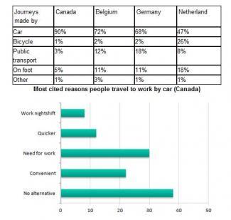
These figures depict the
proportion
of journeys made by five different forms of transport in three different nations and the most cited reasons the Canadian individuals travel by car to work. It is clear from the graphs that the highest percentage shown on the table Use synonyms
chart
is for Use synonyms
Add an article
a car
the car
car
in all countries.
Fix the agreement mistake
cars
According to
the table Linking Words
chart
, there is a high Use synonyms
proportion
of journeys made by car in Canada, Belgium and Germany, accounting for about 90%, 72% and 68% respectively. Meanwhile, the Use synonyms
figure
for Use synonyms
on foot
in Belgium and Germany remained at the same level, representing approximately 11%.
Add a hyphen
on-foot
While
in the bar Linking Words
chart
, the Use synonyms
figure
for no alternative is the greatest Use synonyms
proportion
, constituting more than 35%. Use synonyms
However
, the Linking Words
figure
for Use synonyms
work
nightshift is the smallest Replace the word
working
proportion
, accounting for only 7%.
Use synonyms
To sum up
, we could say that the tiniest Linking Words
figure
shown on the table Use synonyms
chart
is for other in Canada and Germany, compared with the other forms of transport.Use synonyms