The chart below shows how frequently people in the USA ate in fast food restaurants between 2003 and 2013. Summarise the information by selecting and reporting the main features, and make comparisons where relevant.
IELTS Writing Task Chart for The chart below shows how frequently people in the USA ate in fast food restaurants between 2003 and 2013. Summarise the information by selecting and reporting the main features, and make comparisons where relevant.
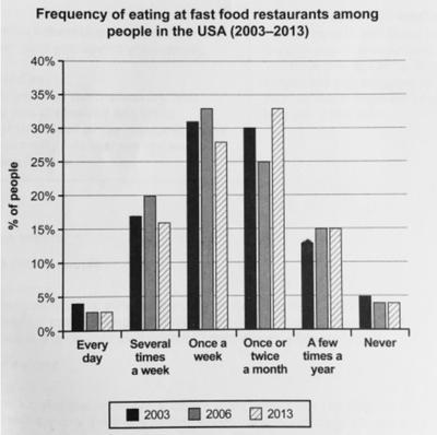
display the frequency Americans ate in fast food places during
on
Change preposition
apply
show examples
the timespan of a decade (2003-2013).
nek.belmezos
Unauthorized use and/or duplication of this material without express and written permission from this site's author and/or owner is strictly prohibited. Excerpts and links may be used, provided that full and clear credit is given to Writing9 with appropriate and specific direction to the original content.
Sentences: Add more complex sentences.
▼
Linking words: Add some linking words.
▼
Linking words: Add linking words.
▼
Introduction: The introduction is missing.
▼
Introduction: Change the first sentence in the introduction.
▼
Introduction: The chart intro is missing.
▼
Basic structure: Write more paragraphs.
▼
Basic structure: Add more body paragraphs.
▼
Common mistake: Your writing should be 150-250 words.
Basic structure: Change the first paragraph.
▼
Introduction: The chart intro is missing.
▼
Basic structure: Write more paragraphs.
▼
Vocabulary: Only 0 basic words for charts were used.
▼
Vocabulary: Use several vocabularies to present the data in the first paragraph.
In the current world , individuals think that authorities should invest tax-payer income to develop and fix the healthcare sector , while others disagree and suggest the utilization of this money in other areas . I personally believe that healthcare enhancement is indispensable . So, huge investments should be established in order to provide the optimum prevention and treatment to the community . On one hand , those who are against the government's full funding for healthcare institution tackled other crucial concerns such as climate change , transport and education . They suggested equal funding to each sector , and they claimed that because they are the ones who pay the taxes ; they have the right to decide how to divide them . Some added that people should pay for their healthcare services and insurance companies can cover a wide range of the treatments offered . Conversely , some argue that healthcare is the most important fundamental service to be provided and should be totally...
Many people believe that global environmental issues, such as climate change and pollution, can only be solved through cooperation between countries. I completely agree with this view because international collaboration leads to more effective policies and ensures shared responsibility.
Technology is involved in many fields and plays a multifaceted role. Payment, for example, these days, many people utilise phone apps rather than a card for payment. From my point of view, I believe cash will disappear in the future, and cards might be used only for formal purposes. In this essay, I will explain why I think that is a fact about the near future.
While many claim that giving minors the freedom of thought on all matters makes it possible for them to become highly egocentric, I believe that this is not the case since a child’s decision is often based on various components to form who they are, and it is crucial that all children gain permission to be present in every choice they make so that they can improve their cognitive skills.
Plastic waste has become a major global issue, and the situation is continuing to worsen each year. I believe that understanding the causes and consequences of this problem can help in developing effective solutions. This essay will explore the main impacts of plastic pollution and suggest possible measures to address it.