
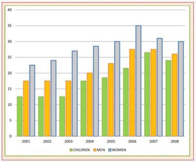
The graph illustrates the comparison of people who consume five portions of fresh produce daily in the UK within 7
years
. Use synonyms
Overall
, women had the highest daily fresh produce Linking Words
consumption
throughout the Use synonyms
years
.
As Use synonyms
it
is presented in the chart, the Correct pronoun usage
apply
percentage
of daily fresh produce Use synonyms
consumption
reached its peak in 2006. At that time, women had the highest Use synonyms
consumption
Use synonyms
percentage
of fruits and vegetables, followed by men. The number of women who ate fresh produce daily increased gradually up until 2006, it went down quite significantly by 2007 from 35 Use synonyms
Use synonyms
percent
to slightly above 30 Change the spelling
per cent
Use synonyms
percent
and reached 30 Change the spelling
per cent
Use synonyms
percent
in 2008.
Change the spelling
per cent
In contrast
to the trend explained before, the Linking Words
percentage
of men and children who consume fruits and vegetables shared a similar trend, specifically in the first three Use synonyms
years
. Both segments had Use synonyms
consistent
Correct article usage
a consistent
number
until Fix the agreement mistake
numbers
it
picked up in 2004. The only difference is when both segments reached Correct pronoun usage
they
its
highest Correct pronoun usage
their
consumption
Use synonyms
percentage
. Men reached Use synonyms
its
highest in 2006 Correct pronoun usage
their
then
decreased constantly in the next following Linking Words
years
. Meanwhile, the highest Use synonyms
percentage
of fresh produce Use synonyms
consumption
by children reached its highest in 2007, with a slightly higher than 25 Use synonyms
Use synonyms
percent
but lower than men’s Change the spelling
per cent
percentage
that year. Use synonyms
This
number fell slightly to a little below 25 Linking Words
Use synonyms
percent
in 2008.Change the spelling
per cent